
Jazzmans by Sodexo
Creating a world of calculated improvisation.

There are lots of sexy places where we expect to find innovation, but a hospital coffee shop isn’t one of them. Sodexo, the global food services company, brought us on to help inject a shot of espresso into their Jazzmans brand. It was time to evolve it from a bit of a jazz cliche into a legit competitor in today’s cult coffee culture.

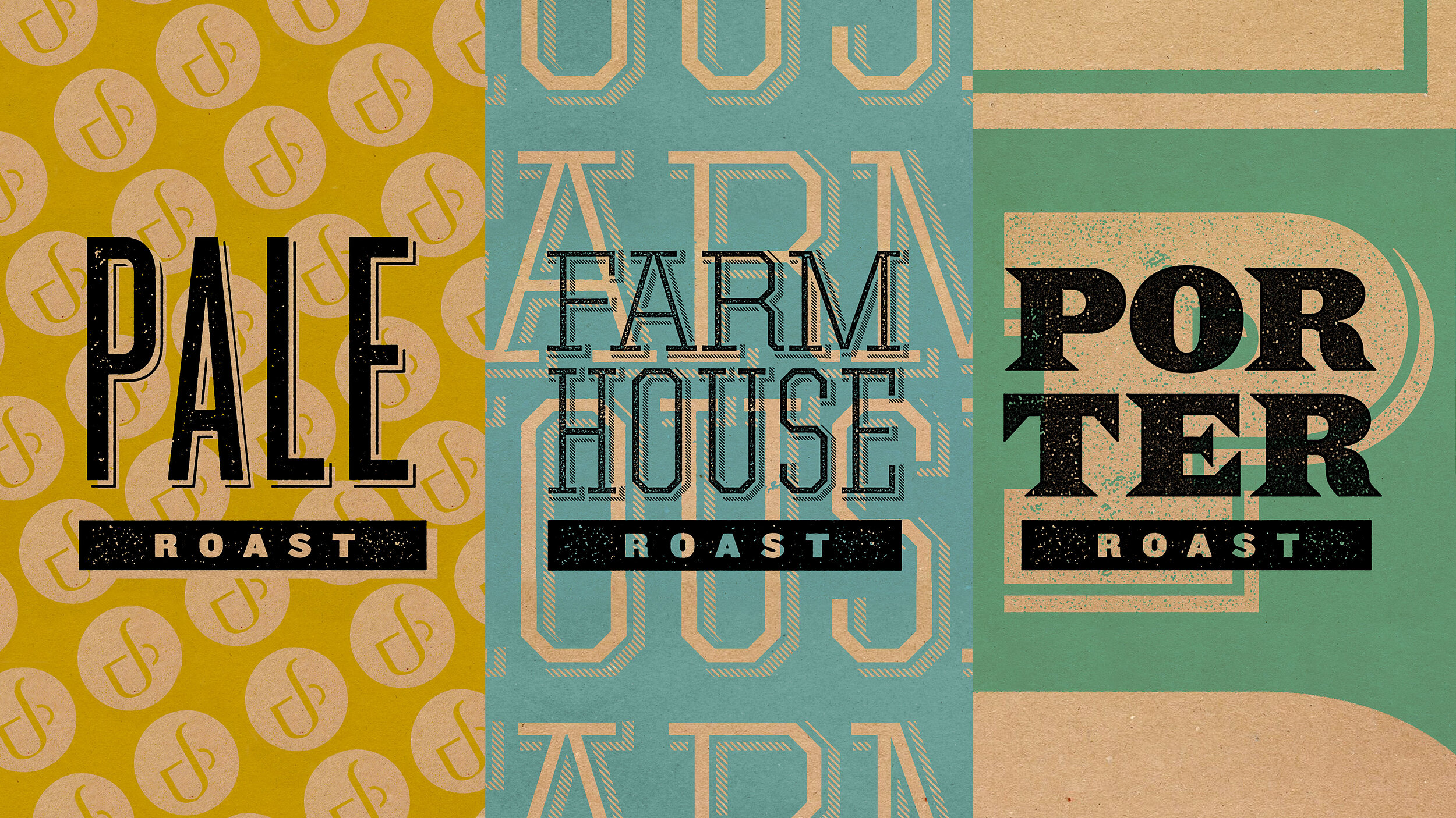
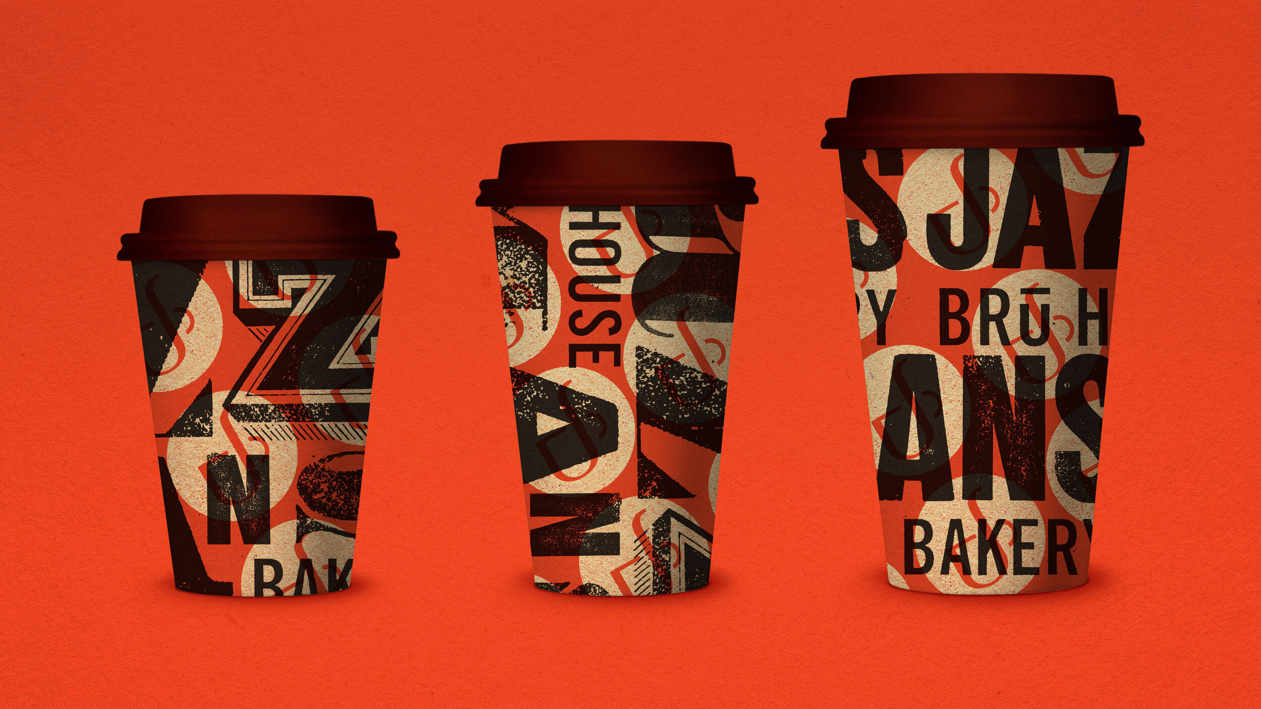
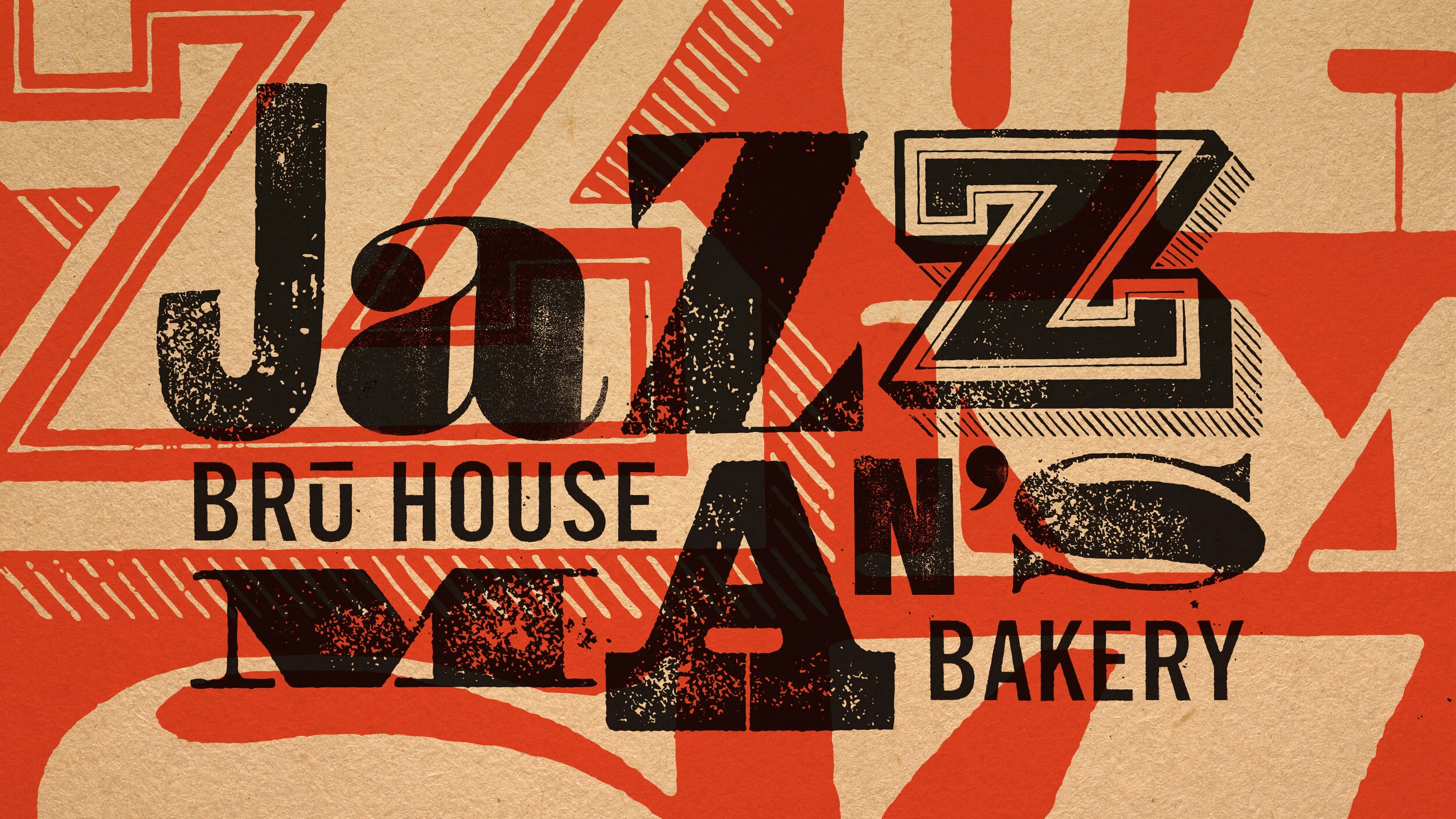
As we dug in, we saw that coffee shops aren’t all, or even mostly, about coffee. Today, people aren’t necessarily spending more on coffee, they’re spending more on high quality coffee experiences. We looked at the whole Jazzmans brand experience and reimagined it from furniture and music to artwork and lighting. The Jazzmans wordmark needed a bit of caffeine, too. In keeping with the idiosyncratic vision for the cafes, we used vintage woodcuts to create the new mark. No letter is from the same font family.

Results
Sodexo tests all brand concepts and naming with an iCommunity of over 200 people. The Jazzmans reimagine earned the highest rating ever scored by Sodexo. The new cafe designs are being rolled out nationwide.
More work

Navarro Saxophone Mouthpieces

GetRealGetRaw
Cannondale Bicycles